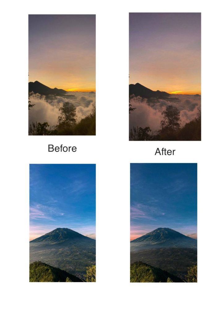
For this project, I edited photos (before and after), then I edited two photos. Here is the explanation. The first poster shows a sunrise mountain scene in before and after. The before image has natural colors and soft contrast, while the after version looks warmer, more dramatic, and more cinematic with stronger tones and clearer details.
The second poster also highlights editing changes. The before image appears natural with a bright blue sky, while the after version has deeper colors, higher contrast, and sharper details, making it look more vibrant and professional.